Games and Graphics Level 3
Hello and welcome to the section of my website dedicated to my work done during the Games and Graphics Level 3 course at Preston College.
Here you can find all of the projects that I have done, along with details on how I got there.
Contents
Serif & Sans Serif
Serif and Sans Serif are two common fonts, the difference between the two is that Serif has the fancy flicks on the letters and Sans Serif does not, it is a cleaner font and generally known as more modern.
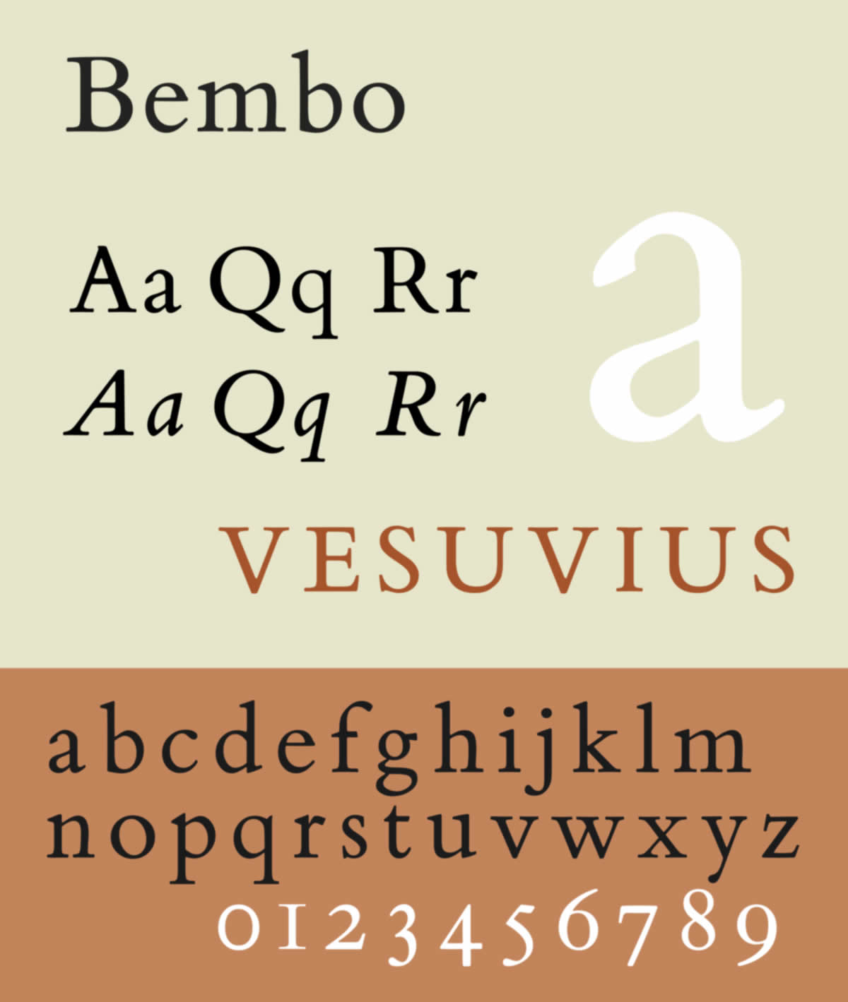
Bembo Typeface
Bembo is a serif typeface much like Times New Roman and is mainly used for body text (an example of body text is this paragraph you are reading right now).
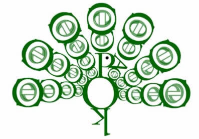
Bembo’s Zoo
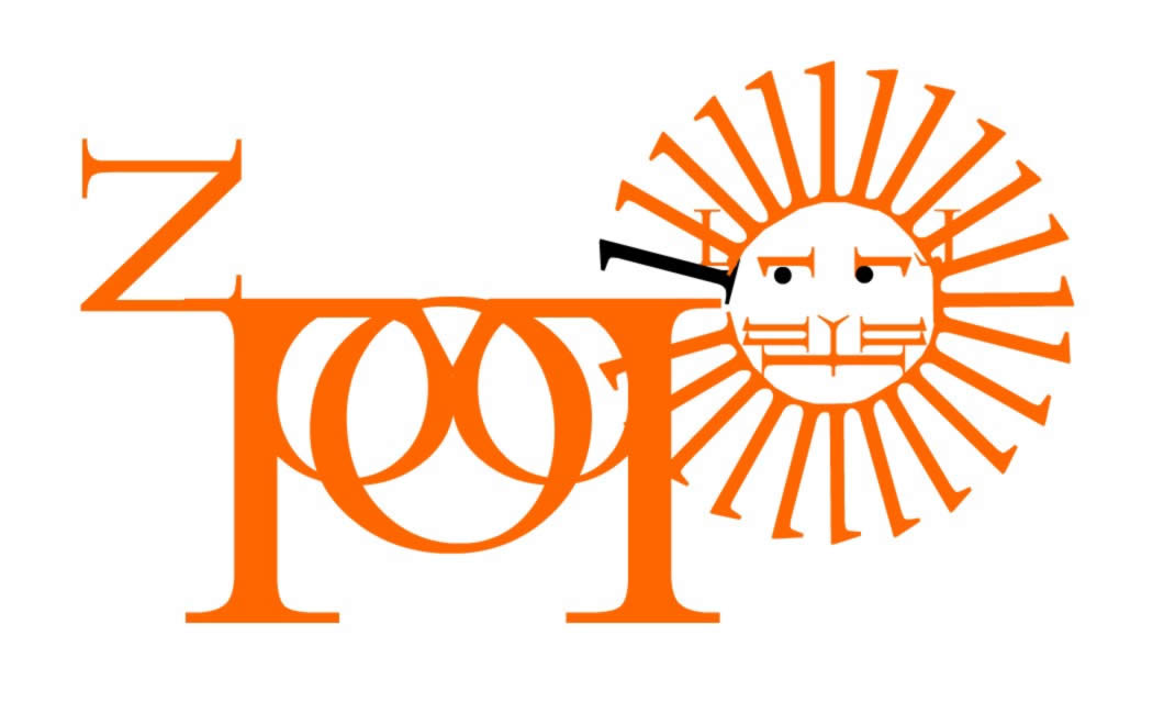
Bembo’s Zoo was an interactive website, based on the book of the same name, that used the shapes of letters to form a bigger shape of an animal, along with an animation and sound effects. Whilst the website is no longer available due to flash player ending support on websites, there is a full video demonstrating it on YouTube, this video is embedded below, along with some screenshots.
Lion Project
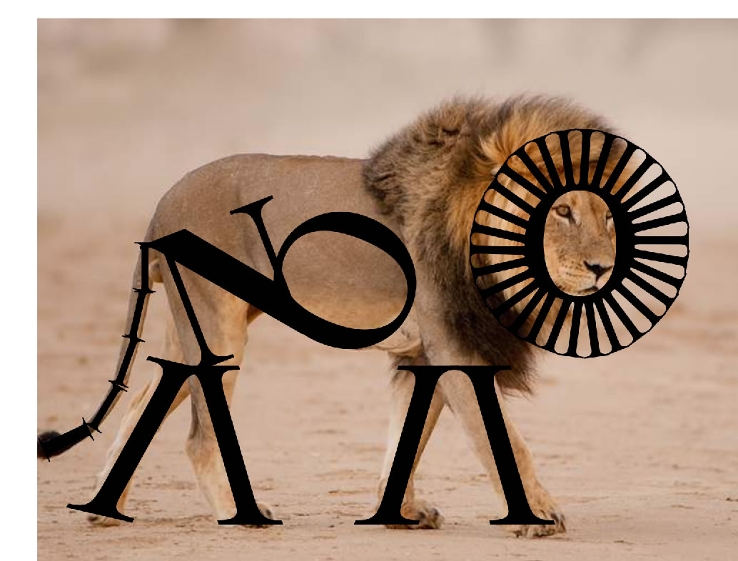
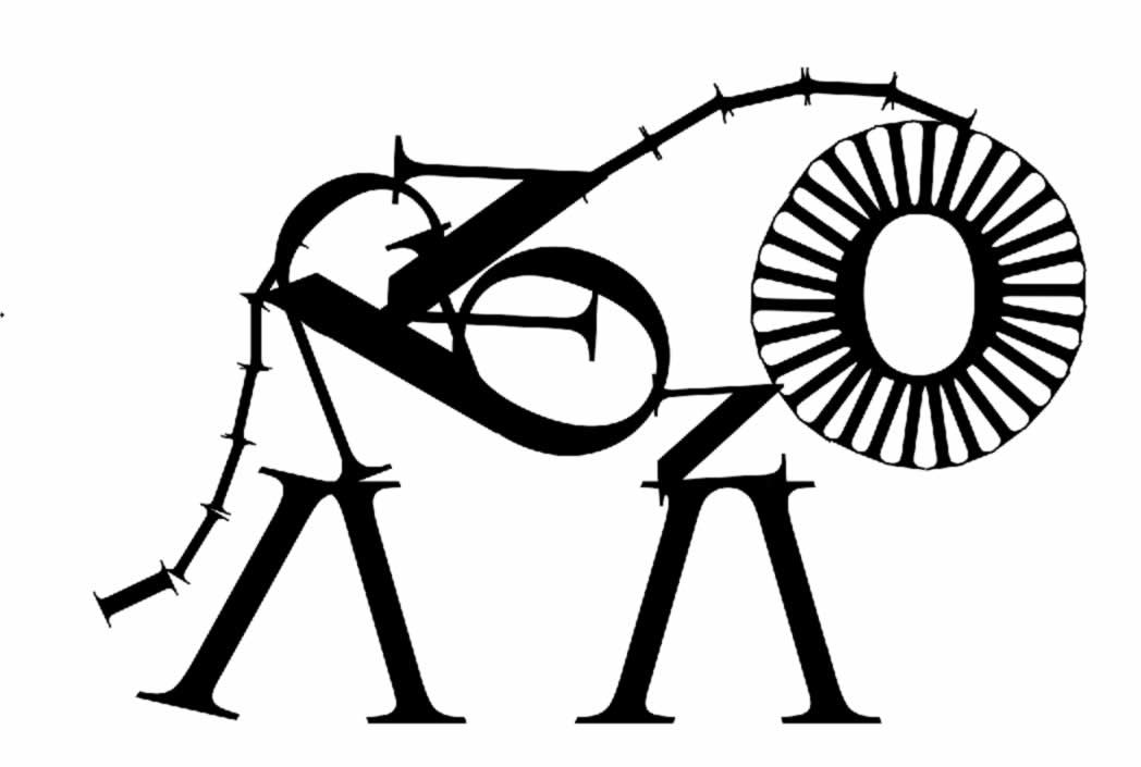
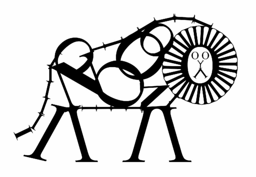
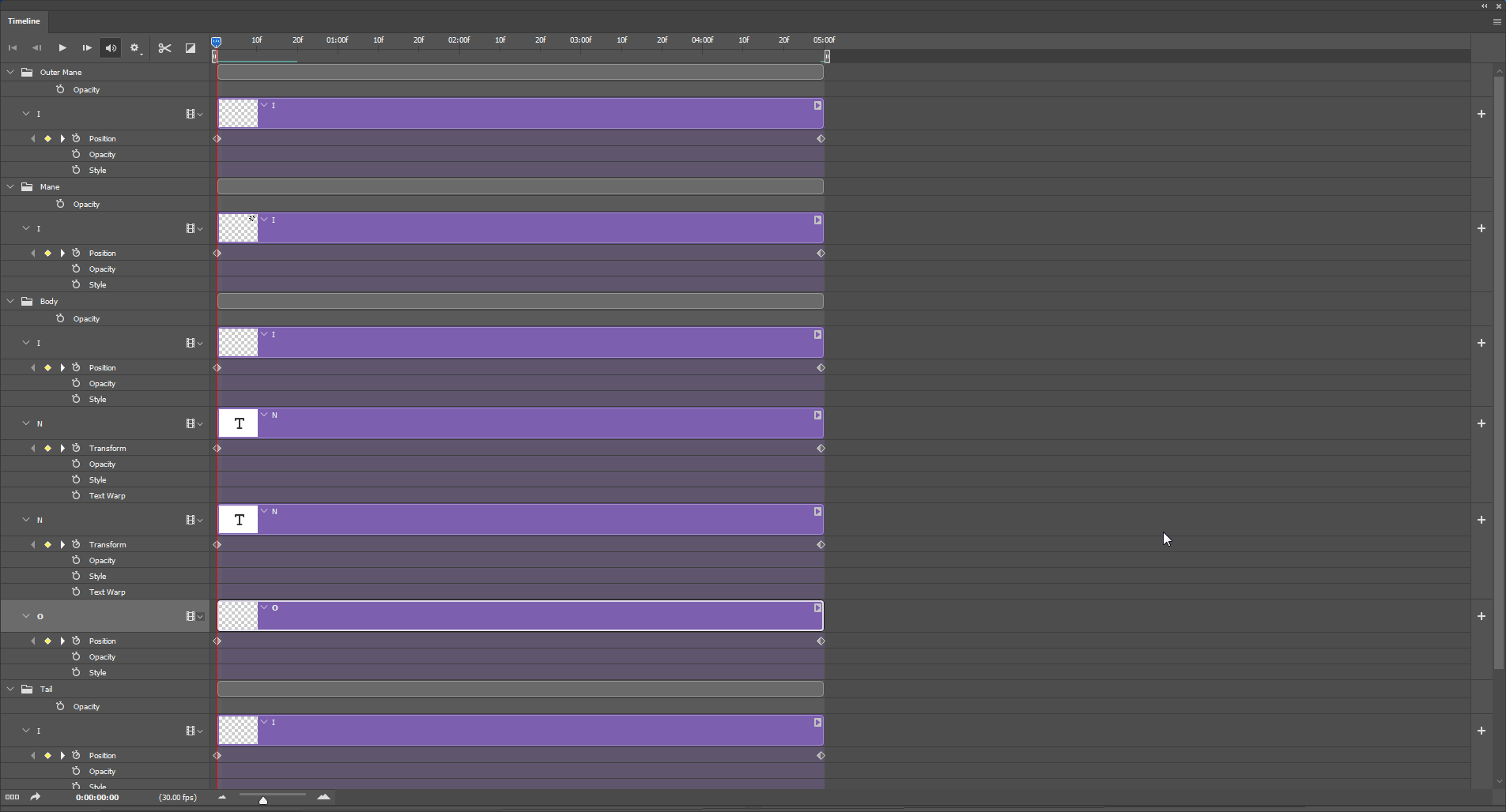
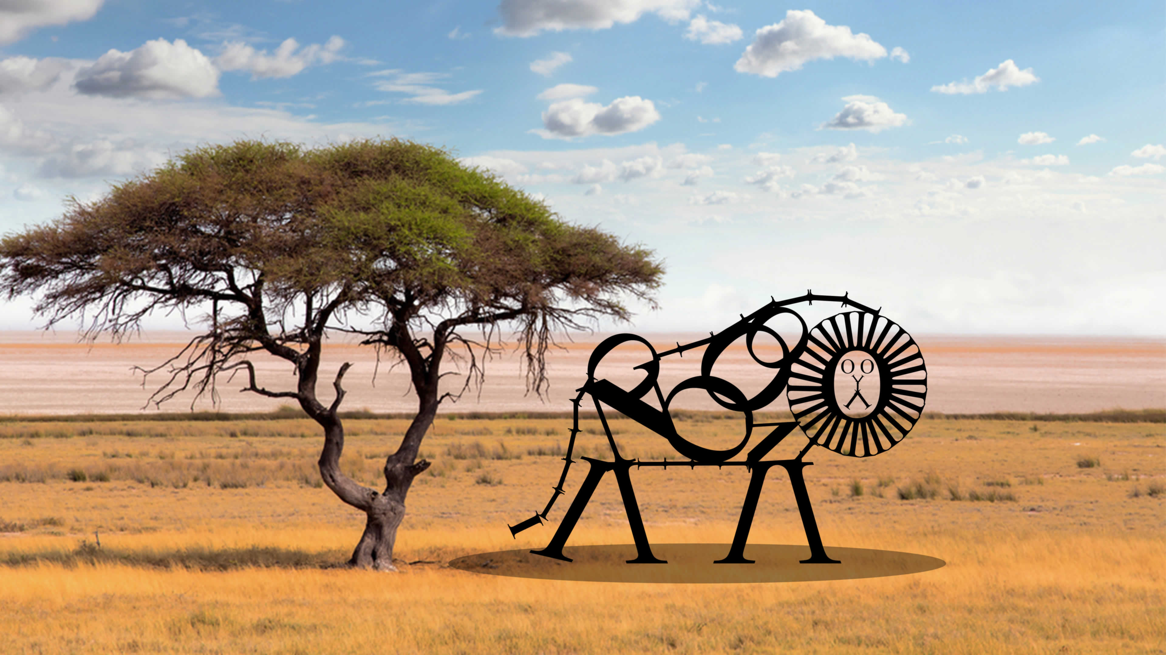
Here is my first attempt of making an animal, I have chosen to make a lion. The font I have used is Times New Roman. There are three progress updates along with one put in a background that could realistically be its habitat. I have also created an animation using photoshop, which a screenshot of the timeline, along with the embedded video can be found below.
Terminology
Alignments
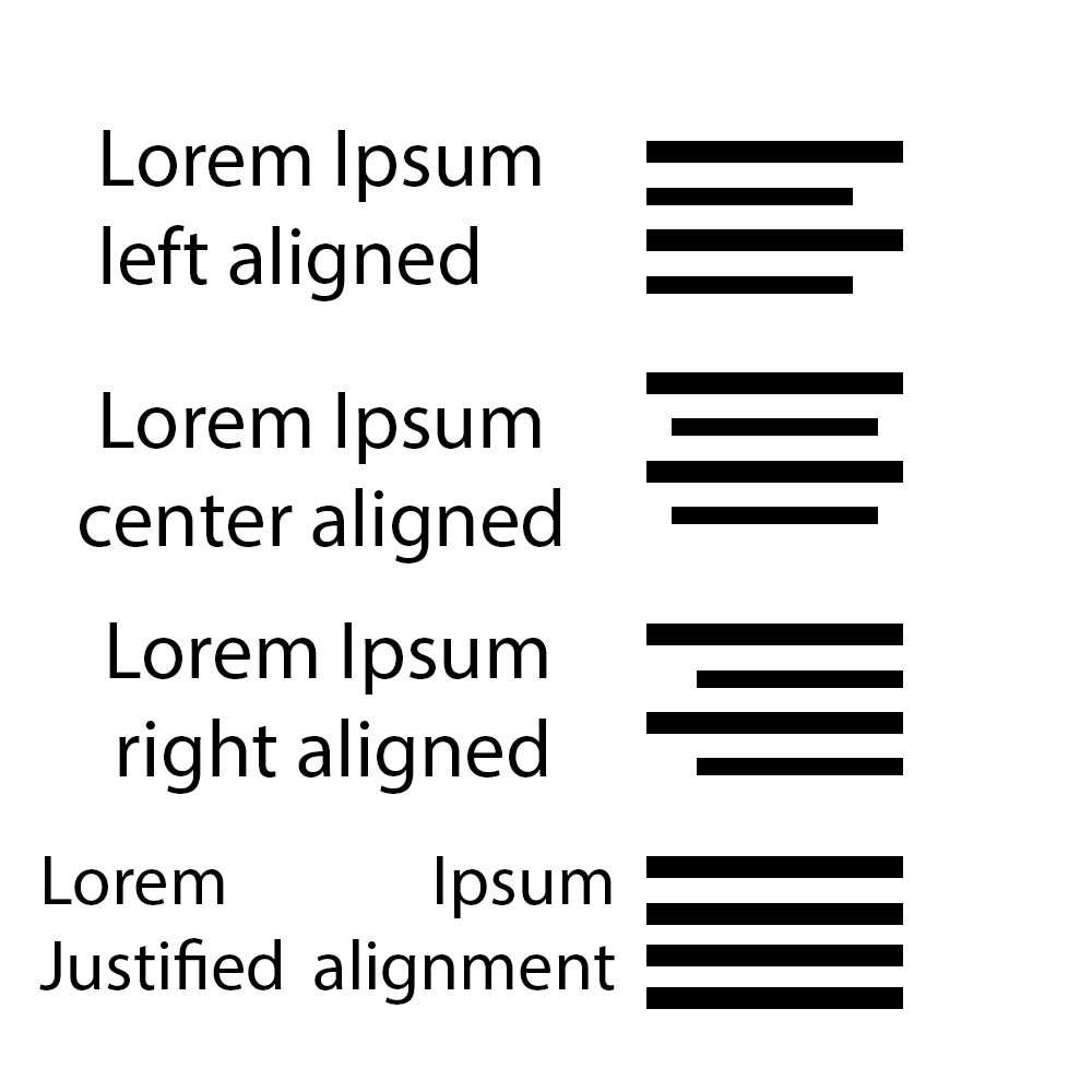
Left alignment is where all text begins from the same place on the left.
Right alignment is where all text begins from the same place on the right.
Centre alignment is where all text begins from the same place in the centre.
Justified alignment is where all text is aligned to the same place on both the left and right, when there is one line that is longer than another, the spacing of characters may be changed.
Adjustments
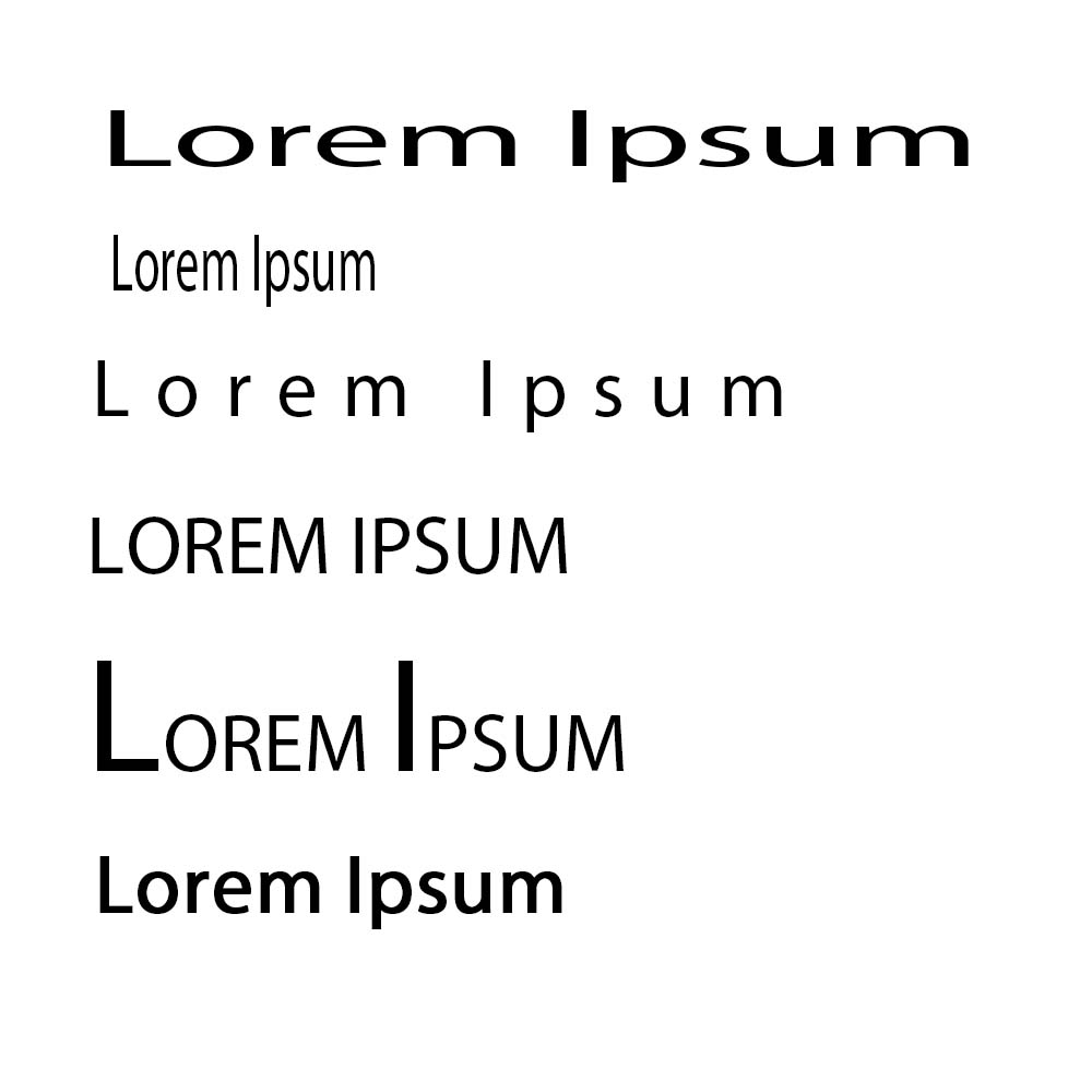
Here are some common character adjustments:
Kerned or kerning, this is the increase or reduction between spacing between characters.
Type weight, this is the increase or decrease of the thickness of lines used in a font.
Upper-case, this is the name for capital letters in the context of typography.
Expanded, this is a type face where letters have been made wider without adding weight.
Drop caps, this is where text is all upper case, but the first letter is of a larger font size.
Condensed, this is where letters have been made narrower without adding weight.
Spacing
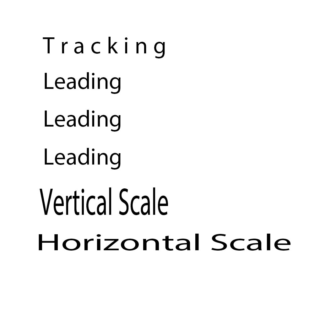
Tracking is the spacing between the characters horizontally.
Leading is the spacing between words vertically.
Vertical scale stretches or shrinks text vertically.
Horizontal scale stretches or shrinks text horizontally.
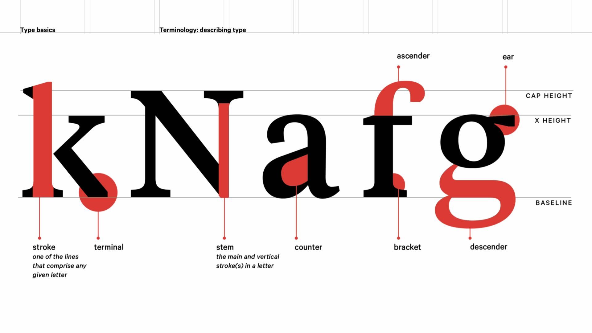
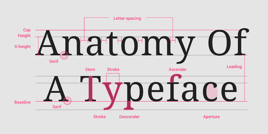
Anatomy Of Typeface
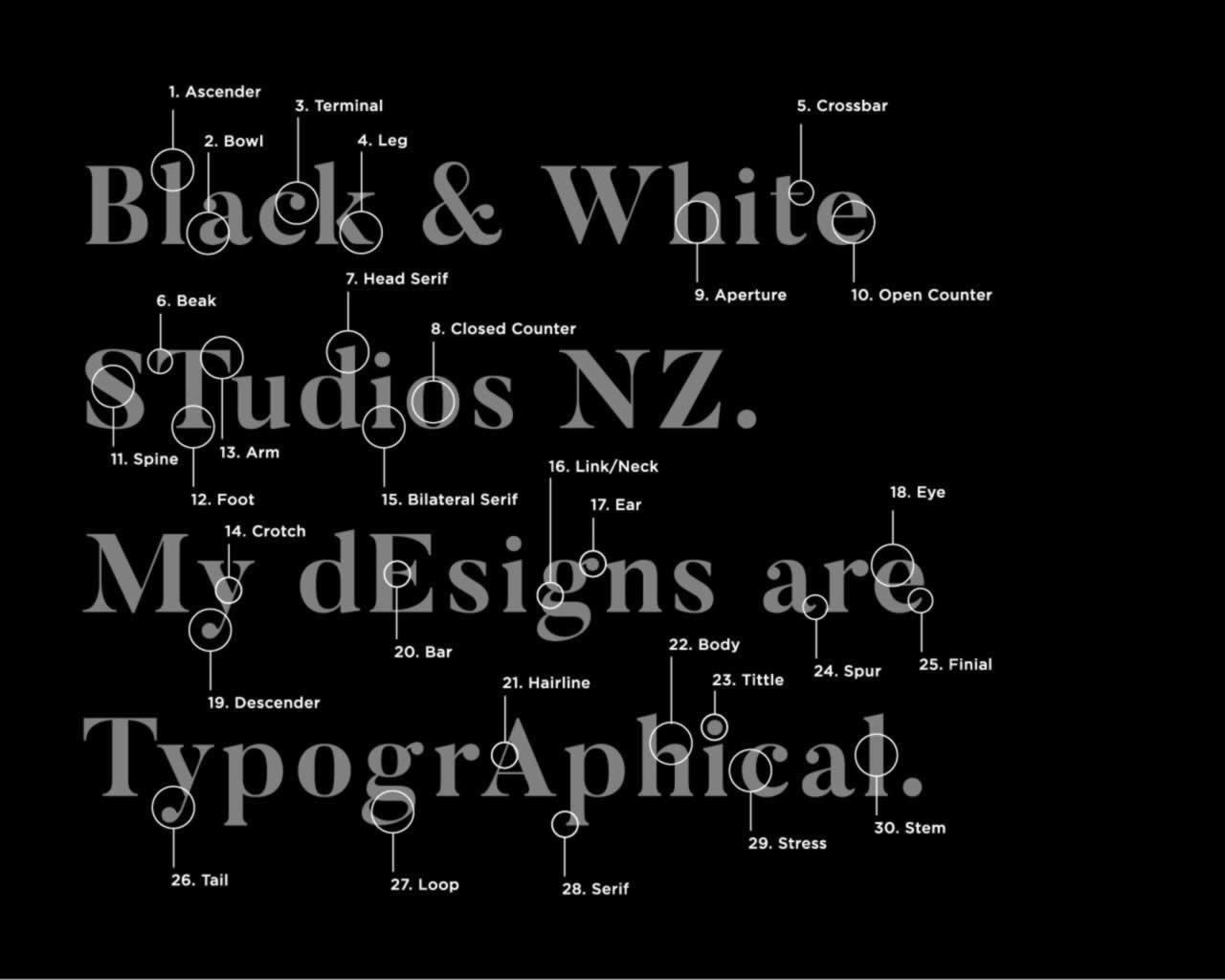
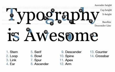
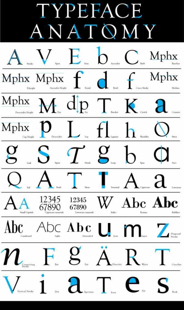
These images all show the anatomy of typeface, a deeper dive into what different elements of the typeface are, and what they do. Each of these are extremely boring to look at but do get the point across quite effectively. There are five example images below.
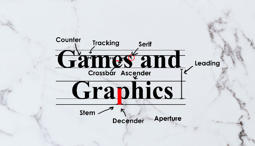
I have created a design to demonstrate various typography terminology. Unfortunately, I have lost the original PSD file for this, but here is a screenshot that I took of it.
The “Games and Graphics” text is 72px in size and uses the Times New Roman font. The labels are in Sans Serif and are in 18px size. I have also added lines to help visualise descender (which I spelt wrong on the image) and ascender (which is missing). It is much easier to see them. Where required, I have also shaded some parts of letters in red, and used lines and arrows to help with annotations
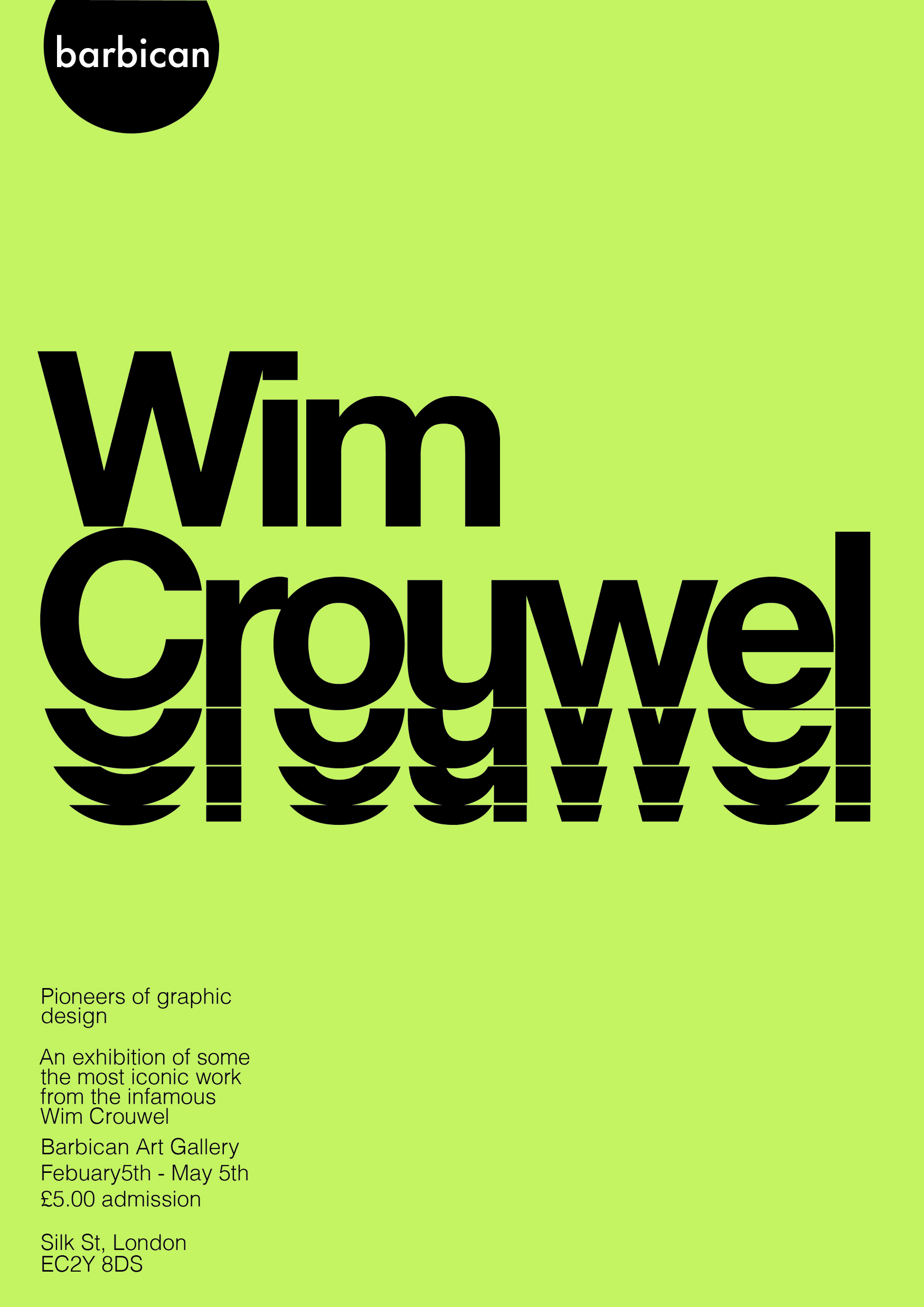
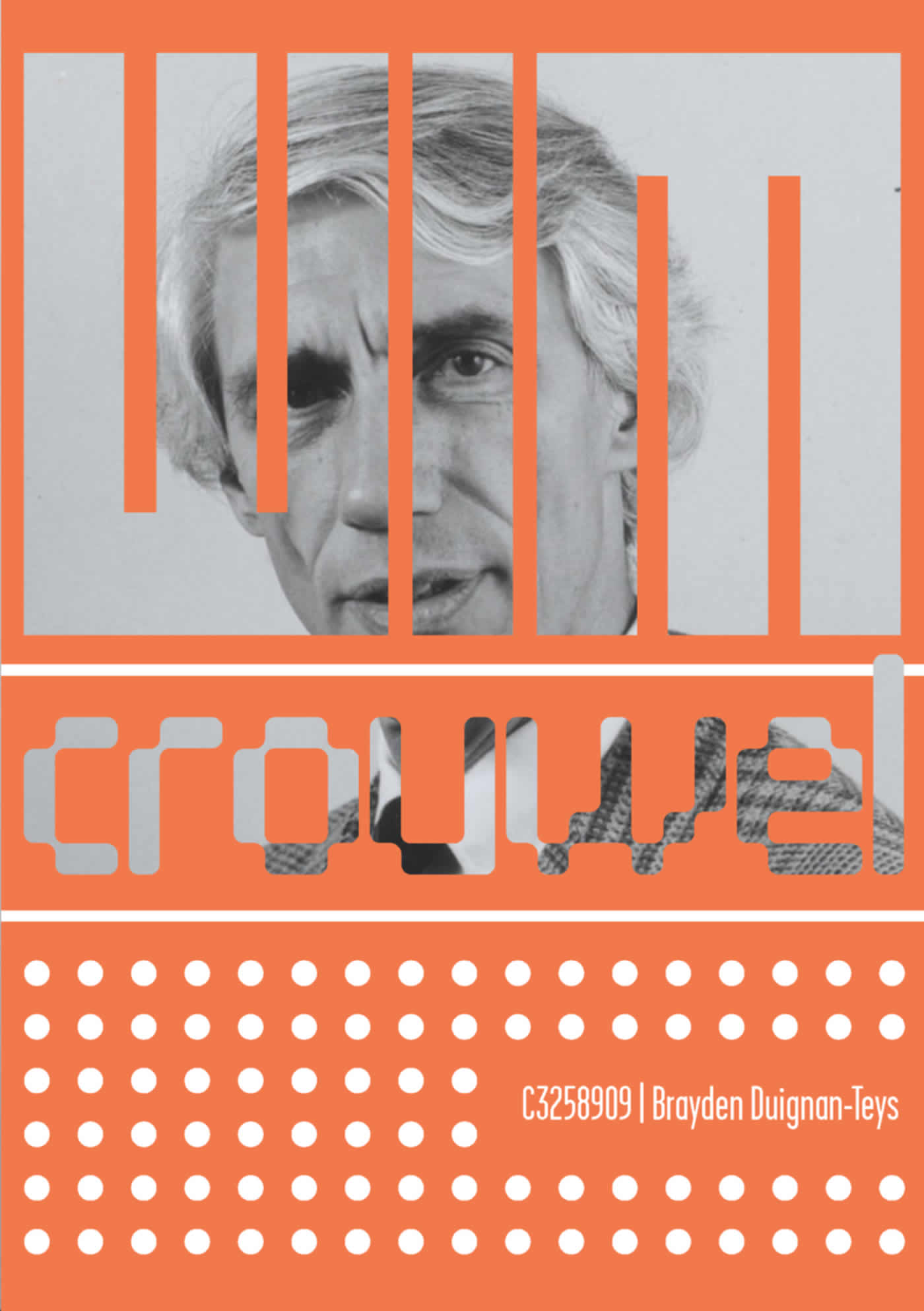
Wim Crouwel
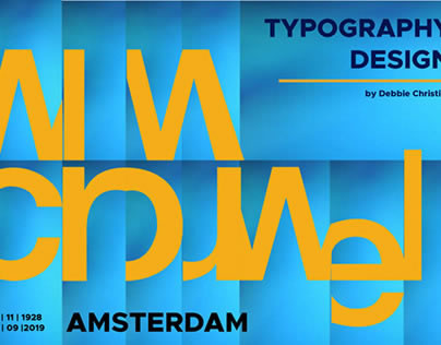
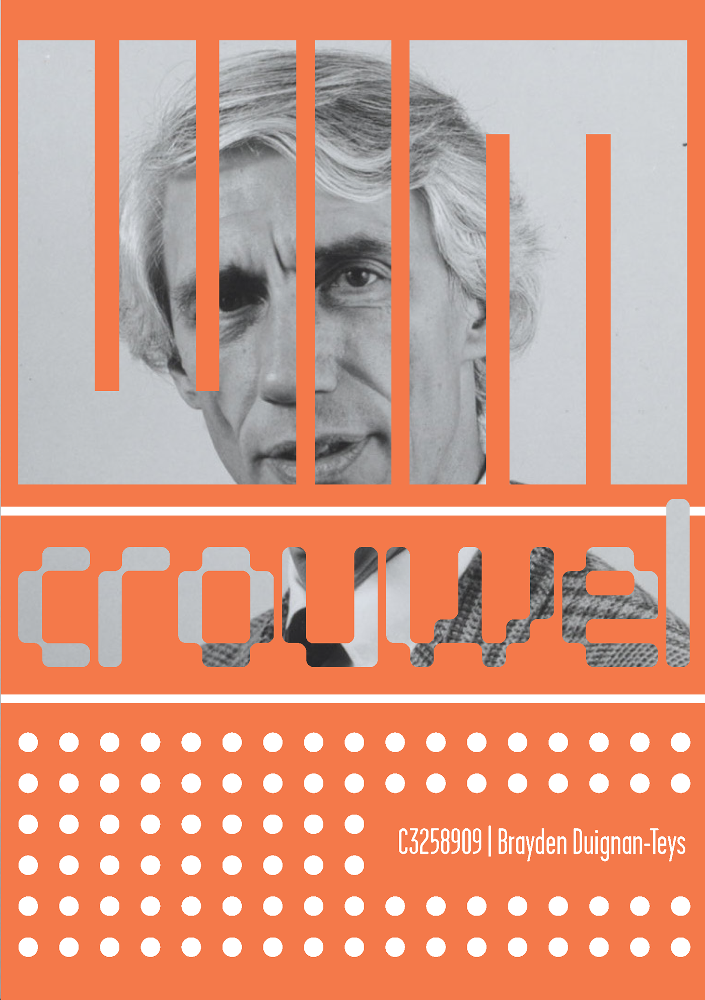
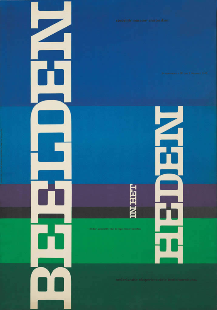
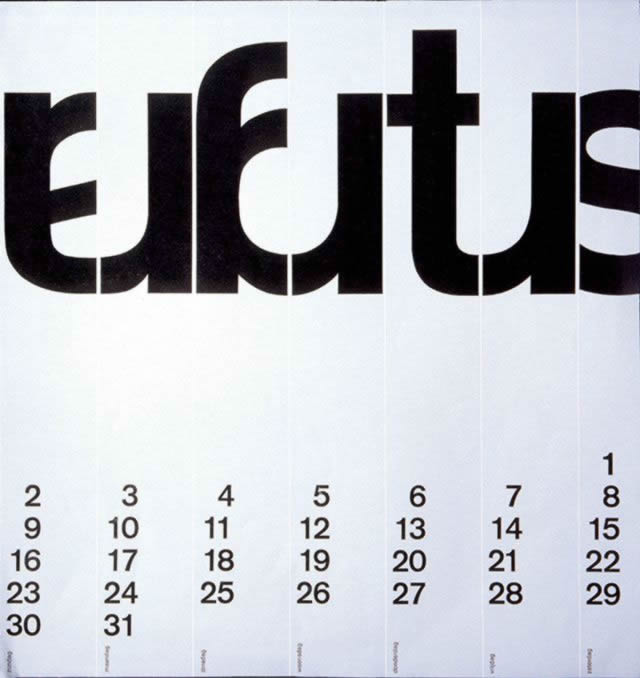
I have been researching the works of Wim Crouwel. They are made up of cropped letters which join, or vertical cropping primarily. There are six examples below.



Paula Scher
I have been researching the works of Paula Scher. They are made up of cropped letters which join, or vertical cropping primarily. There are six examples below.
